
So, being stuck without access to Photoshop and my regular Windows PC has taught me a little about GIMP – basically it’s exactly the same as Photoshop with a less slick UI :D.
Also, since I haven’t really written anything tutorial-ish in many many years, so this is as much about brushing up on those skills as anything else.
This is a guide for quick and simple photo enhancement using GIMP.
NOTE: I find GIMP infinitely more usable in Single Window Mode. Enable this by toggling the “Single Window Mode” option in the “Window” menu.
Firstly, I like to take a billion pictures of my subject or scene at the highest reasonable resolution the camera supports - provide maximum amount of data to manipulate (preferably RAW, though this example assumes a JPEG source file). I try to keep The Rule of Thirds in mind - though it’s more like a guideline than actual an actual rule (see what I did there?), since the first step of my post-processing procedure will normally tweak the image focus somewhat.
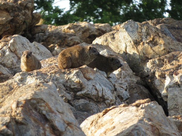
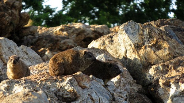
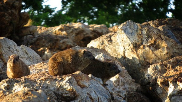
Here’s my source 4:3 image for this example (totally unruly):
1. Cropping
 I start with
cropping, since it gives me an idea of the focus of my image, and
narrows down some of the colour data which has to be considered in
future steps. I also like to convert my images to 16:9 aspect ratio, for
better full-screen viewing.
I start with
cropping, since it gives me an idea of the focus of my image, and
narrows down some of the colour data which has to be considered in
future steps. I also like to convert my images to 16:9 aspect ratio, for
better full-screen viewing.
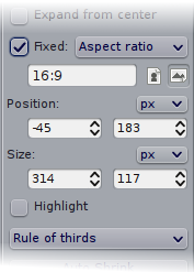
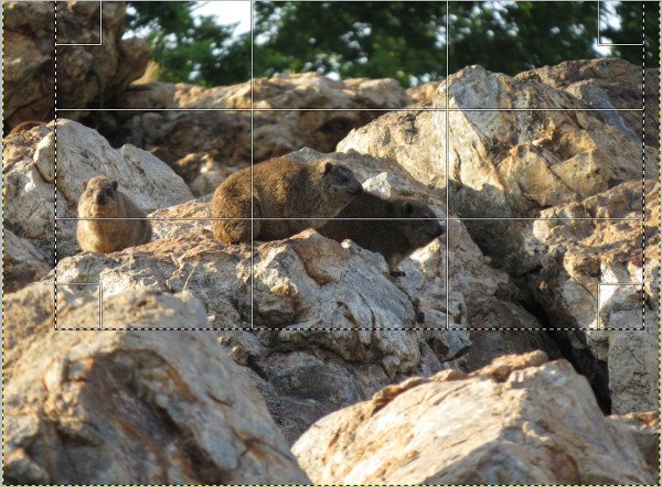
GIMP’s
 Rectangle Select
allows simple definition of an aspect ratio, and just for fun, allows
you to turn on a thirds grid. Set your selection options, define your
selection, and from the menu, select “Image” ->
“
Rectangle Select
allows simple definition of an aspect ratio, and just for fun, allows
you to turn on a thirds grid. Set your selection options, define your
selection, and from the menu, select “Image” ->
“
 Crop to Selection”,
to execute cropping.
Crop to Selection”,
to execute cropping.
2. Levels
Next up, some colour tweaks. I start with the Levels tool, found in the
“Colors” -> “
 Levels” menu.
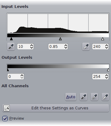
As far as this lot’s concerned, I have no idea what I’m doing, but pulling the little triangles around generally results in a better looking image. Basically, dragging the left-most (Black) one inwards will darken the image - colours below the selected level will be rendered black. The right-most (White) one will brighten the image - colours above the selected level will be rendered white.
The middle one (Grey) sets the mid-point - more to the right will darken the image (more levels are on the “dark” side of the scale), more to the left will lighten the image (more levels are on the “light” side of the scale).
Your level tweaks will vary depending on your source image. I prefer to pull both black and white in slightly, rather than plating with the Brightness/Contrast tool, and move grey a little toward the white side (darken the image), since most digital shots appear very washed out at their default levels.
A very important toggle in this window is the “Preview” checkbox. Adjust your levels, and toggle it on/off to see the difference between your source and tweaked image. You are essentially discarding image data here, so use with care.
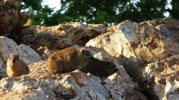
My image now looks as follows (changes are subtle!):
3. Hue and Saturation
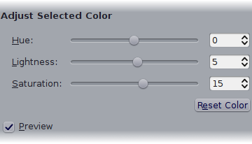 An optional last stop as far as colourising goes, is a subtle hue and
saturation tweak to bring out any extra colour in the image.
An optional last stop as far as colourising goes, is a subtle hue and
saturation tweak to bring out any extra colour in the image.
Whip out the “Colors” ->
“
 Hue and Saturation”
menu option, and following the same process of adjustment and toggling
of the “Preview” option, you’ll likely want to increase the
Saturation of the Master channel a little - this increases the
vibrance of colours in the image. Tweaks to Lightness may also be in
order. Hue is less useful in most cases - it basically shifts colours
through the spectrum, resulting in some “funky” effects.
Hue and Saturation”
menu option, and following the same process of adjustment and toggling
of the “Preview” option, you’ll likely want to increase the
Saturation of the Master channel a little - this increases the
vibrance of colours in the image. Tweaks to Lightness may also be in
order. Hue is less useful in most cases - it basically shifts colours
through the spectrum, resulting in some “funky” effects.
In my example, I also increased the Saturation of the green channel, to bring out the trees in the background a little.
4. Vignette
I guess this one may be a little controversial, and is entirely optional. It does not work on all images, and is not always appropriate. For my uses, it generally involves slightly darkening the edges of the image, to pull focus inwards a little.
I’m not aware of any built-in effects to achieve this, so we can do it quite easily manually.
 Add a new solid black layer above your source photo. Then using the Ellipse Select tool,
create a large ellipse selection just inside the bounds of the entire
image. With the black layer selected in the Layers panel, press
Delete. You should see a result as per the image on the right.
Add a new solid black layer above your source photo. Then using the Ellipse Select tool,
create a large ellipse selection just inside the bounds of the entire
image. With the black layer selected in the Layers panel, press
Delete. You should see a result as per the image on the right.
 Next, clear the ellipse selection, and with the black layer still selected in the Layers
panel, select “Filters” -> “Blur” -> “Gaussian Blur” from
the menu. Increase the Blur Radius option dramatically (in my example
image of 3500px by 2000px, I needed a value of 400px). Apply, and you
should get out something as per the example on the right.
Next, clear the ellipse selection, and with the black layer still selected in the Layers
panel, select “Filters” -> “Blur” -> “Gaussian Blur” from
the menu. Increase the Blur Radius option dramatically (in my example
image of 3500px by 2000px, I needed a value of 400px). Apply, and you
should get out something as per the example on the right.
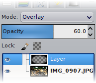 Finally, we tweak the layer mode (drop-list at the top of the Layers list in the Layers
panel). For a dark/shadow vignette as in this example, the “Overlay”
mode, along with some reduction in opacity works best.
Finally, we tweak the layer mode (drop-list at the top of the Layers list in the Layers
panel). For a dark/shadow vignette as in this example, the “Overlay”
mode, along with some reduction in opacity works best.
To preview before and after, toggle visibility of the vignette layer by clicking the small eye icon next to the layer. This should give you a good idea of whether your changes are improving the image, or just ruining it :D.
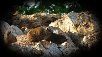
Final example image:
Original image for reference:
Have fun, and remember to always try to keep your enhancements subtle, unless gaudy effects, high contrast or blown-out colours suite your scene :D