Seems like it’s only been 4 years since the last time I did this. Really feels a lot longer.
Anyway, I was becoming rather annoyed with trying to keep Ruby Gems and things updated and working, with plugins breaking and stuff with Jekyll, and I recently built a few other websites using Hugo, which made me quite keen on switching.
Hopefully everything’s carried over properly with all the right URLs and things. I’ve also tried to improve some things, and will be expanding the Projects section which I feel doesn’t represent everything that goes on.
As for the style: I just wanted to do something a little more fun and retro looking.
My first website (“Shrimp’s Maps”, the precursor to “ShrimpWorks” and the first website I ever made, which I used for sharing Unreal Tournament levels in early 2000), featured a silly “tech” look with blue gridlines and a cool angular header graphic thing, and all the text was monospace Courier New. Unfortunately it’s completely lost in time.
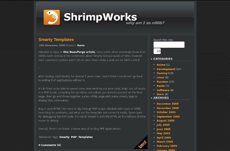
Once I upgraded to Wordpress in ~2005 after using a system called Geeklog for a while after Shrimp’s Maps, I adopted the content-with-sidebar style, which I switched away from at some point in favor of menus, so for more throwback fun, I’ve replicated that old layout style as well.
It’s perhaps a little busy, but everything’s going to “clean” and stripped down these days, a bit of busy-ness is not the end of the world :).
Here’s how we looked in 2005! Thanks archive.org!

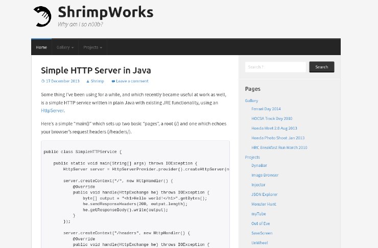
Here’s how we looked in 2014!

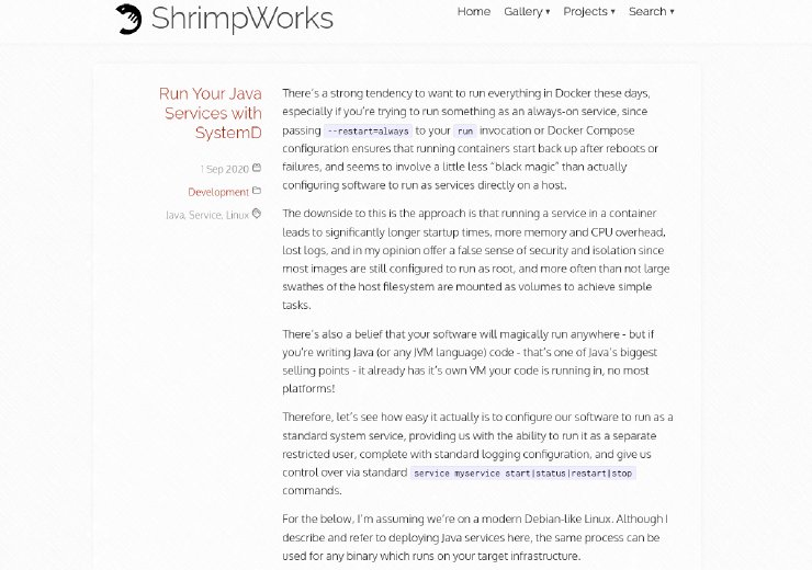
And here’s what we’ve just come from.

